Rental-bidding with a Fairer Twist
Redefine and redesign the LiveOffer Rental App with a simpler journey for the potential renter and the property manager.
Background
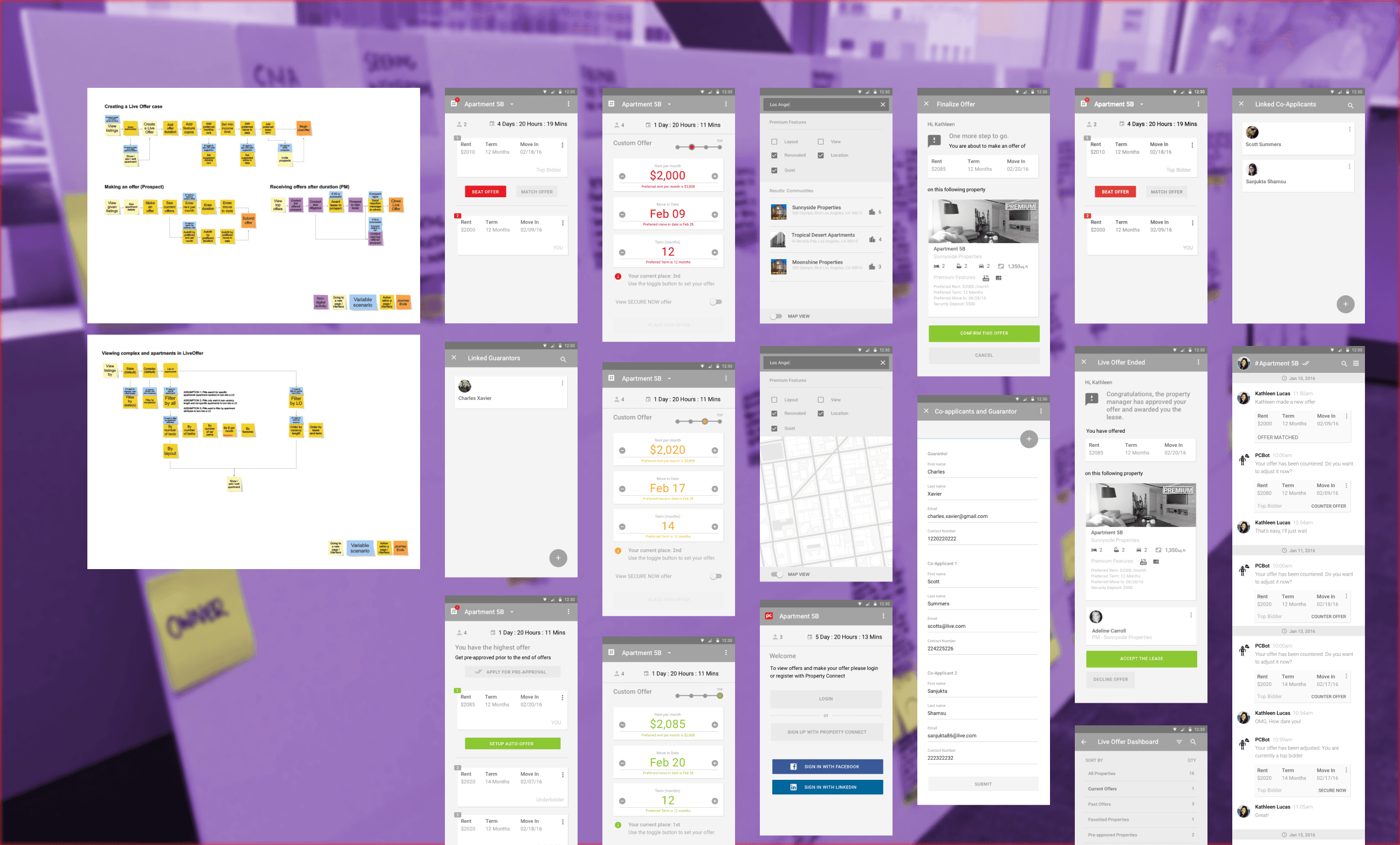
Property Connect initially engaged a consultant to develop the User Interface for their LiveOffer Rental App but encountered significant challenges with implementation, flow logic, and cognitive load for users. To address these issues, Property Connect partnered with Trunk Platform to improve the user journey and enhance the overall usability of the app.
Discovery
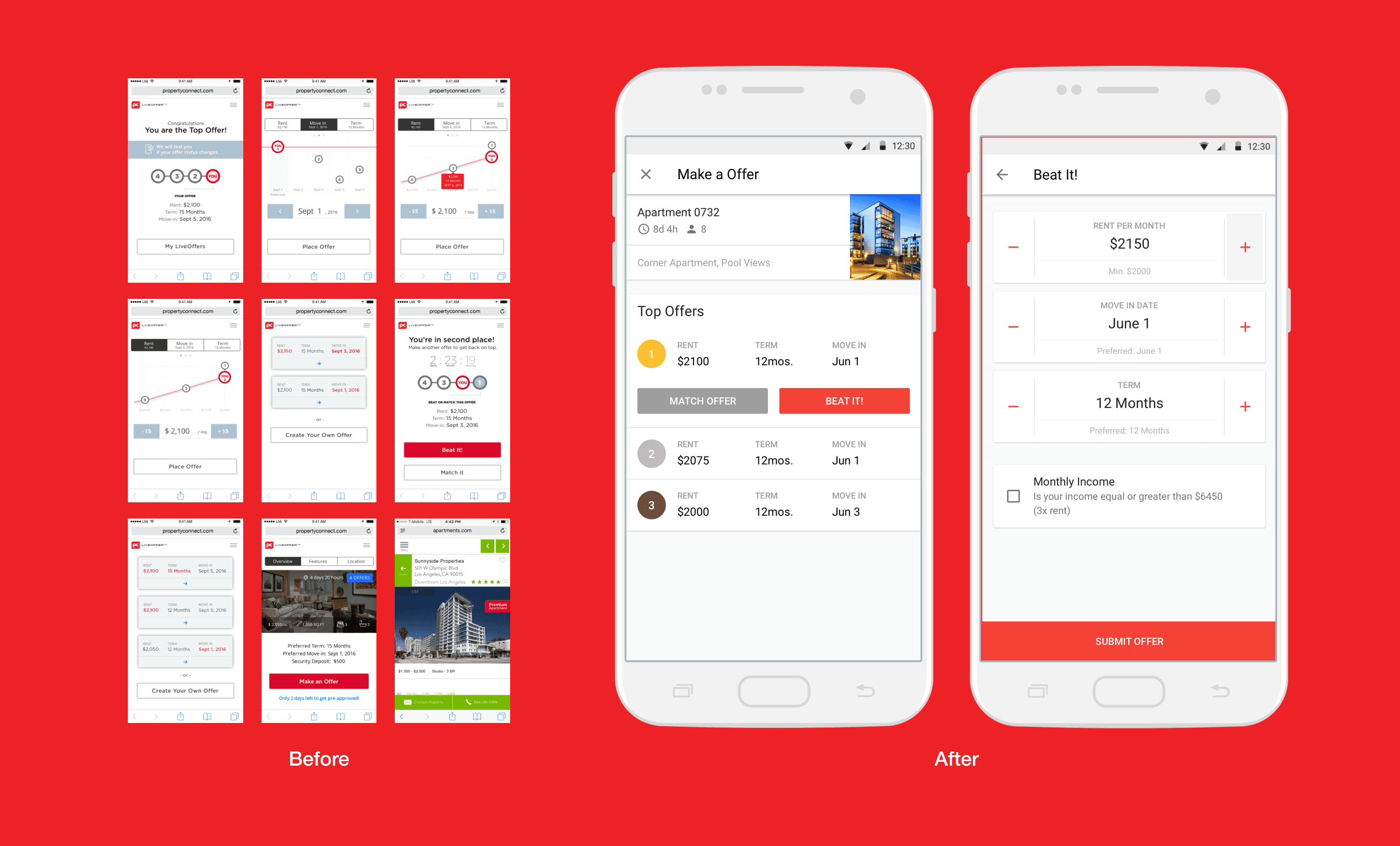
The current Graph Chart UI, while informative, occupies excessive screen space without clearly conveying actionable insights or value.
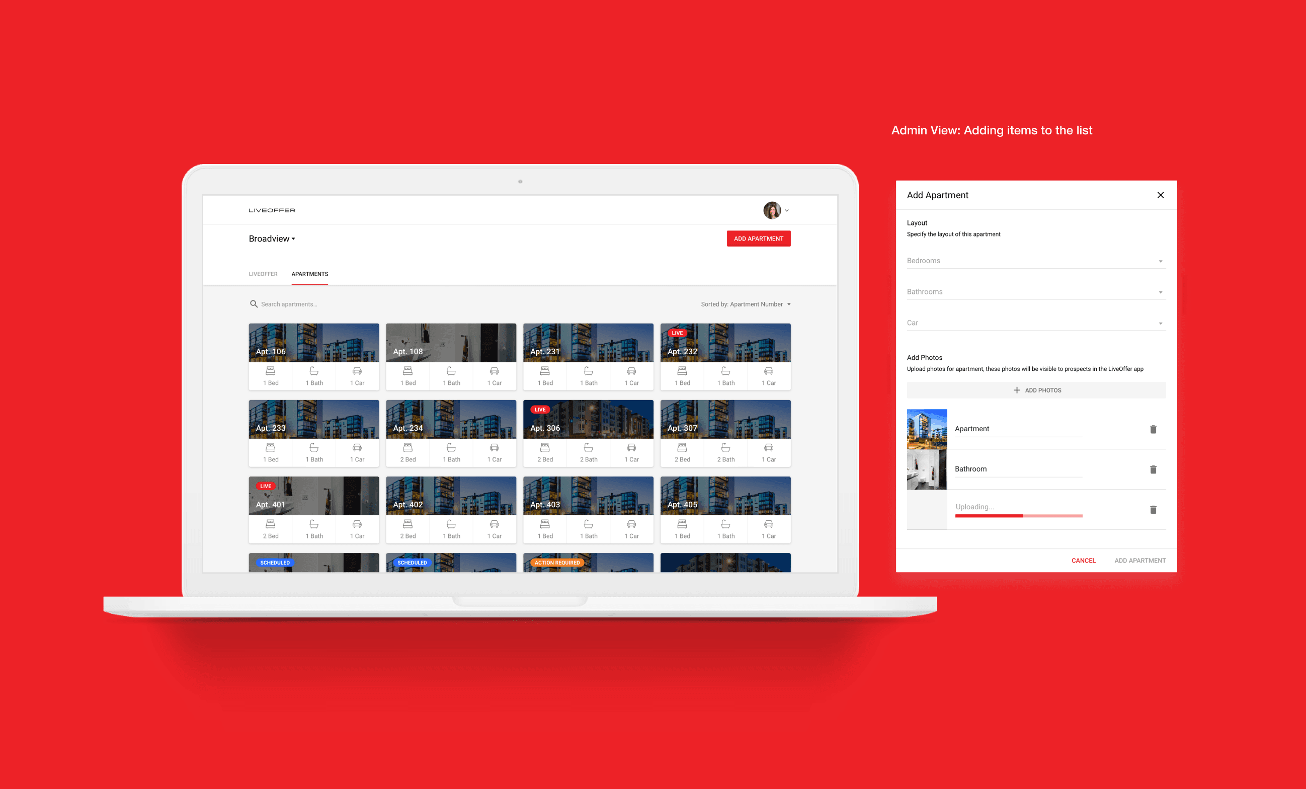
The solution lacks comprehensive functionality for Property Managers or Administrators, limiting its usability for key stakeholders.
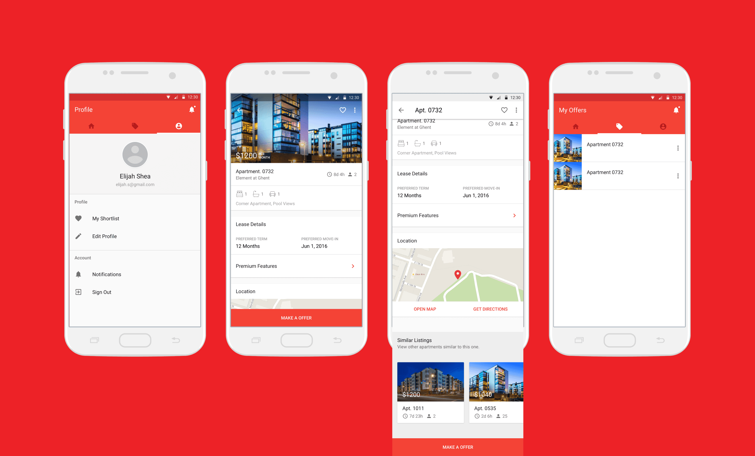
Property details page is absent, leaving out critical information that users need to manage properties effectively.
The interface employs unfamiliar design patterns that deviate from both Human Interface Guidelines and Material Design standards, creating a disjointed user experience.
Results
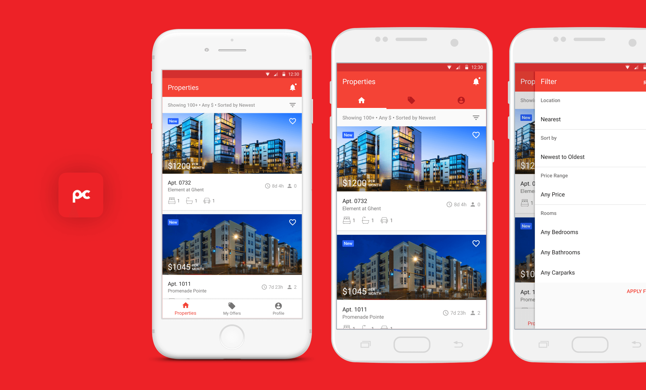
The redesigned user interface offers a cleaner, more intuitive experience by adhering to native UI patterns and guidelines. This upgrade not only enhances usability but also supports a more scalable design system, ensuring consistency across all products. The new interface is strategically aligned with key business objectives, driving increased user engagement and fostering better user retention.
